Use a great colour combination
Your website should look great. It is advisable to use a great color combination. Even if you are not a designer or color savvy, there are tools which help you do this. “Paletton.com” is one such tool. You can pick base colors and choose different color schemes. It provides distance adjustment to choose different colors. Use the hexadecimal format to find your color schemes.

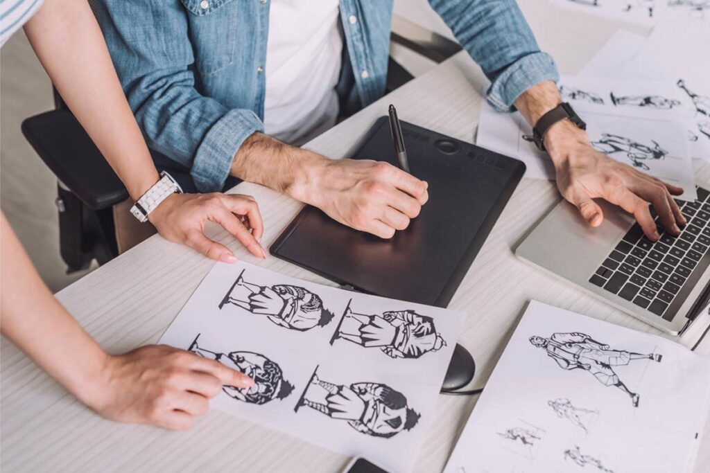
Use great looking images
A picture speaks a thousand words. There are different ways to get great pictures for your websites. Having custom images relevant for you and your business is the best way out. There are great resources both paid and unpaid to get specific pictures which can fulfil your needs. Below are the links of few paid and free resources to find pictures for your websites or blogs.
Free resources for great images:
Paid resources for images for your website:
Check out the rules before using these images. Few pictures might have recognizable faces and such images might have some restrictions on them. Image of the recognizable piece of design like company logos of iPhone or mac photo for example might have special restrictions. But still these are great resources for images.
Space Management and Legibility
Content is still the king and will remain forever. Written words will never die. Once they are on the screen, they are alive. Poor readability defeats the whole purpose of the having the website.
Adding a little bit of extra space especially for text heading and body makes it more readable. Try to make content in points and add short paragraphs. Adding spacing between the paragraphs helps the viewers to scan quickly through the content. Adding additional space between the lines is a good technique.
Bad contrast is another thing to repel your audience. Having a dark background with dark text and a light background with a light text makes the typography too hard on eyes.
This forces the users to leave the page and look for content which is pleasing on their eyes and easy to skim. Almost all the readers leave too much cluttered content and move to other sources of information.
Being Decisive
Using sliders is not good for SEO. This is because people do not wait for your slider to move. They are proactive and start scanning down your page and keep looking
for what they want.
So, it defeats the whole purpose of having a slider. It is a good practice to let your viewers scan down the page and let them decide what they want to look for. It is better to prioritise the content so they see the most important one first. Having sliders reduces the website interactions to a large extent.
Best is to test with different patterns of your site and see which variation attracts more audience for your website or business.
Remember your mobile viewers
Make sure that your website looks great on mobile. There are high chances to forget the tablet and mobile audience in designing the website for desktop users. Tweaking your website design so it looks good on mobile devices attracts a huge audience. Use mobile page builders which can help you build pages specifically for mobile devices.
Content Management
Align and format the typography of your page to make it easy for the users to absorb the content. Use more lists and images in the content’s body to make it easy for consumers to take in.
Unorganized content layout design which is not presentable, or content which is not proper is the last thing you would want. If there are any usability issues, you must fix it.
People skim and not read your content. Add more emphasis on certain words and phrases would help them skim faster.
Navigation needs to be clear. Most websites form a certain navigation pattern because user are used to it. They are consistent and easy for the person to search for content they are looking for.
Decide font combinations before you start. Use the default settings of the theme to set it once and it takes care for your whole website and for all the pages.
If people like your writing style they will keep coming back to you for what you offer.

Animations and its use
Having too many fancy animations is bad for a website. It is better to use them sparingly. Every website type has its own character and variation which should be same for each type.
Use animations in context of your project. Use them consistently and safely.
Keep navigation in context of your website. Bigger the company the more is the number of users and follows more problems if you stick without experimenting what suits for your business model. It is better to be a little more traditional in this approach instead and do it in the right way.
Designs should be consistent throughout your website. Do not make it intentionally inconsistent because you want to stand out and find a place to break the model. Navigation should resemble on every page and aligned to your own website design