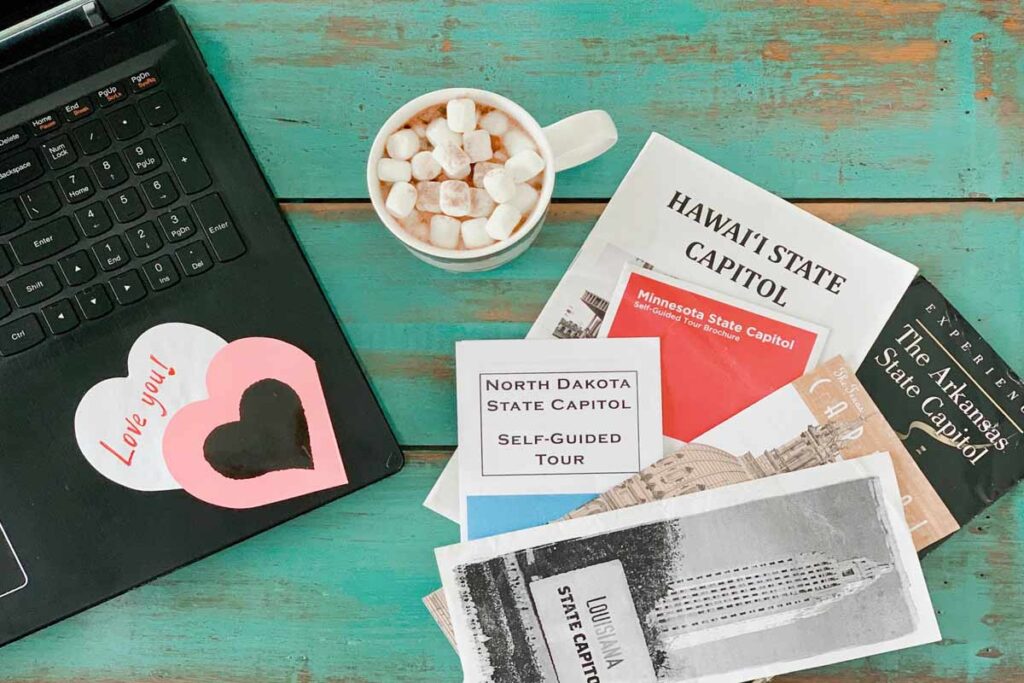
Do’s and Don’ts of brochure design
Brochure Design is an important part of advertising your business. A brochure is a complete introduction of your business and you want people to read it. Therefore, it should be designed in properly. Few of the do’s and don’t in the process of brochure design are as below. Follow these do’s and don’ts in the process of brochure design and make a difference.
Types of Brochures
The very first step in designing a brochure is to understand what kind of brochure you want to have. One type could be a “product brochure” which will be like a catalogue and would display all the products you are selling.
The other type could be a “how to brochure” which will contain all the tips and information on how customers can use your products or services. This could be like a buyer’s guide brochure. Another very popular type of brochure is a “gift idea brochure” which mostly the retail business uses. We can give gifts on birthdays, anniversary, wedding, Christmas or New Year, etc.

Clear Purpose
The purpose of having a brochure should be very clear so you can accomplish what you want to. The purpose of a brochure is to drive people to act. You should be clear if you want them to call you, email you, buy a product or provide credit card details, or they should go to your website to sign up etc. or it is only for educational and informative purposes.
So, deciding the purpose of your brochure in the very beginning is of utmost importance because it will base the design and having it clear will save a lot of time in the long run. It will be easy to come up with the design if the purpose is clear.
Remember Your Brand
Always remember your brand. Remember to tell your story. Your logo should be available on every page of the brochure. Many small businesses use the brochures they get from the marketing agencies or from the manufacturers. Your competition will also have the same brochure. It does not separate you from them and does not communicate your story and not make you different from them.
Balance the text and visual
It is very important to have a balance of the written words and the visual content in your brochure. The photography, images, arts, graphics are important factors in a brochure design. They say,
“A picture speaks a thousand words”. People like pictures and if the pictures in your brochure can tell your story, your job is done.

Avoid Industry Jargon
Avoid industry jargon completely. You do not have to sound educated and smart but simple and easy. Do not go overboard with industry jargon.
Use Headlines
Using headlines grabs attention. People want to know “WIIFM–What’s in it for me?” Give the benefits of your products and services in the headlines. Read it in the customer’s perspective before you complete for printing.
Attract Attention
Get them interested in what you have within your brochure. If you are targeting a specific problem, the customers face and you are providing some solution in your brochure, you will naturally attract attention.
Spend some money
It is understandable that you want to save money. But saving on a brochure is a bad idea. There are many printing services who charge nominal free for a good quality print.
Professions designers will have certain skills, so it’s worth the money. You do not want your brochures to be sitting in the backyard with two inches of dust on them. So, get a professionally designed brochure for yourself.

A professionally designed brochure has:
- As less text as possible.
- The readability is excellent.
- It will have matching fonts.
- All elements are properly aligned.
- A perfect contrast to the eyes.
- A proper font combination, in perfect harmony with the environment and the purpose it is for.
Dealing with Colours
Colour is a huge deal in design. It makes a lot of difference to gain trust of the customers and build a report. Having a lot of colour is not a good idea, but it is important to use colours which aid and improve the readability so that people would want to read, and we can also send our message across them. It should grab the attention of the users and should have right contrast. A contrast that strains the eyes of the readers is something not welcoming.
Have Free Space
There should be a nice balance of negative space. There is no need of having objects filling every space in your design. Having free space is a great thing in design as it unclutters the design and makes it structured.
The best example is Google’s home page which comprises only one element that is the search bar which is what we use it for.
Scaling
Scaling gives emphasis on certain important text. It is necessary to scale elements properly. Elements should be in different sizes so it grabs attention of the users.
Improve Readability
Inadequate space between lines makes it hard to read. Having purposeful line breaks are important for readability.
Clean Design
Use vector shapes and texts to keep your design clean. Never loose resolution. Striving for complete symmetry is unnecessary every time. Creating balance is important and if you can achieve it with little symmetry, it’s okay.
Don’t Overdo
We should not overdo content with too many objects and emphasis. It should get the message across and everything should just fit with a proper amount of white space, use of colour and fonts to balance the rest of the design.
Cohesiveness in design is the key. It should balance colour orientation and use of fonts. Once you follow the above do’s and don’t of brochure design you will see the impact.
We must do our job right. We want to make you look good and save your time and money. Our growth is in your growth.